www.newulmturnerhall.org
|
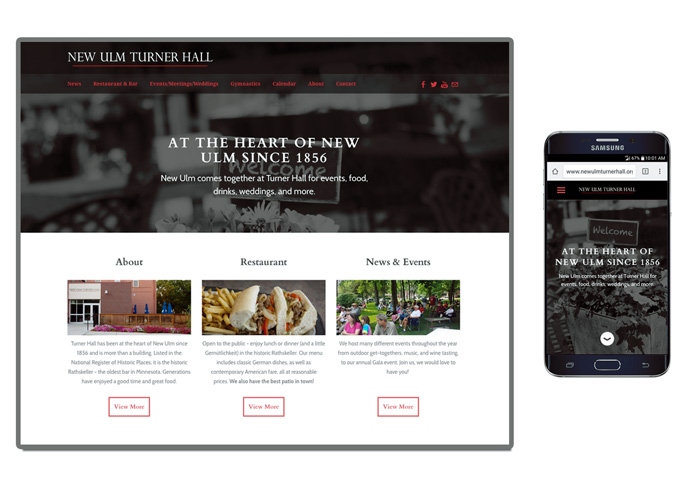
They wanted a modern look and an emphasis on the restaurant and event hosting. This is a responsive layout, so adjusts to all monitor or mobile devices.
www.newulmturnerhall.org
1 Comment
Beyond Real Estate logo design This is a new logo design for a realtor in New Ulm. This also included a design for outdoor signs. Kids X-Cel Center logo New logo for the Kids X-Cel center in New Ulm. They wanted a logo that looked more academic in addition to their day care services, since they also offer early childhood education.
Haven't updated in awhile! I better start again.
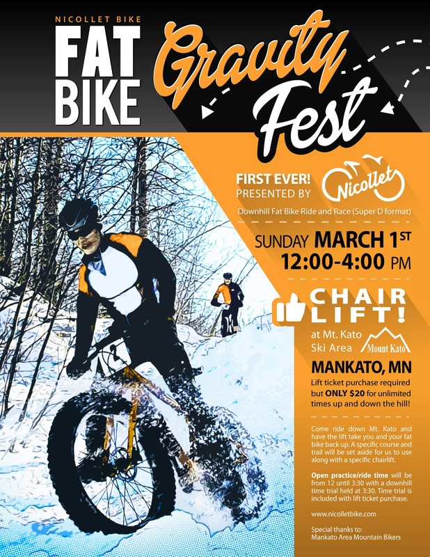
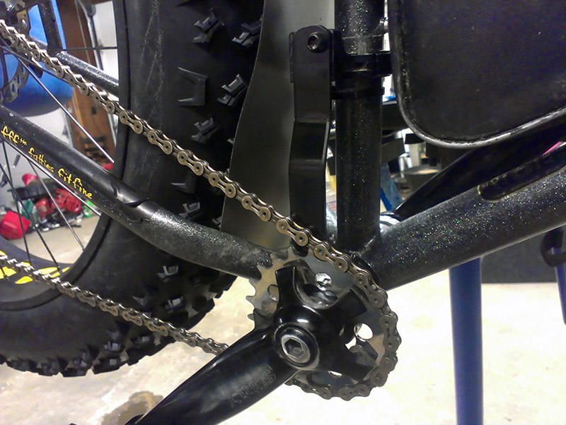
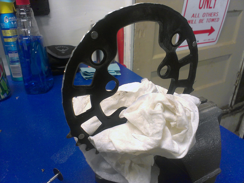
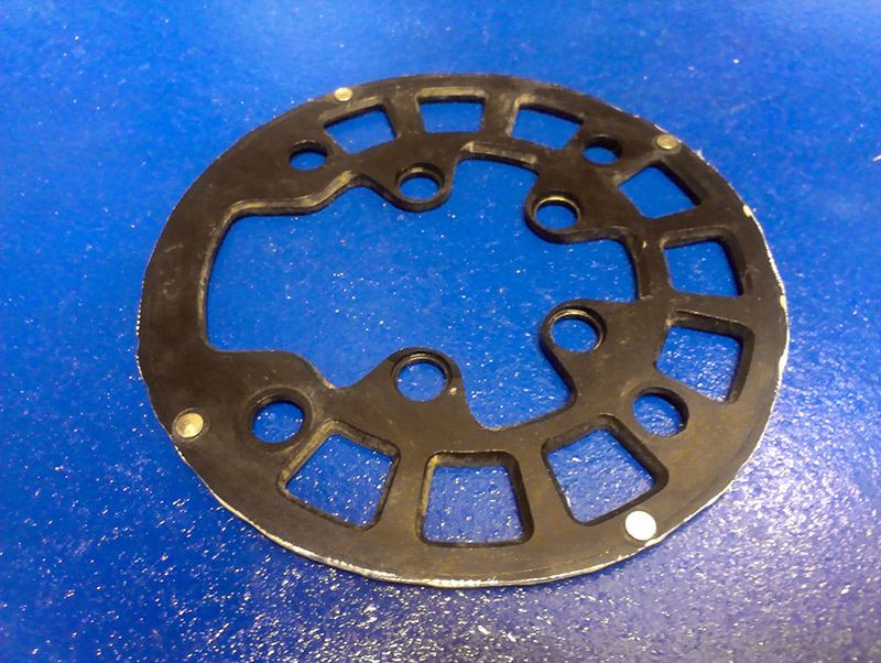
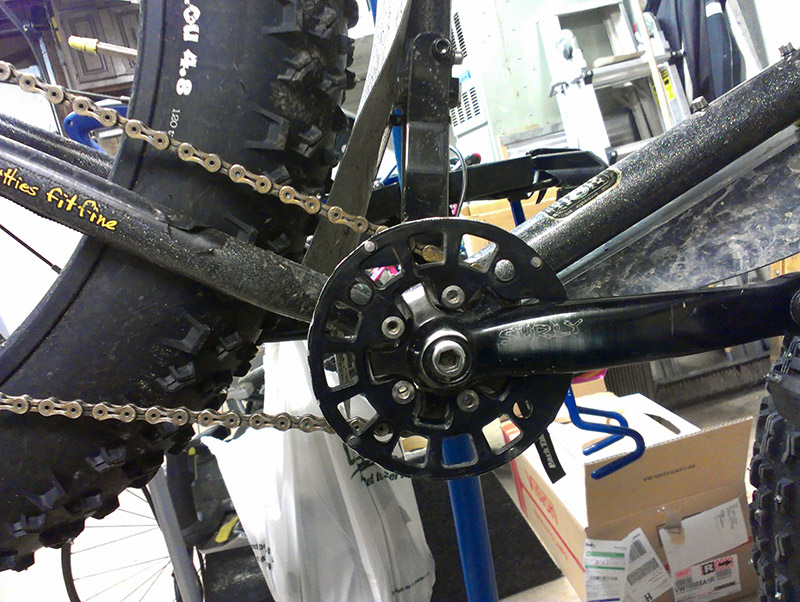
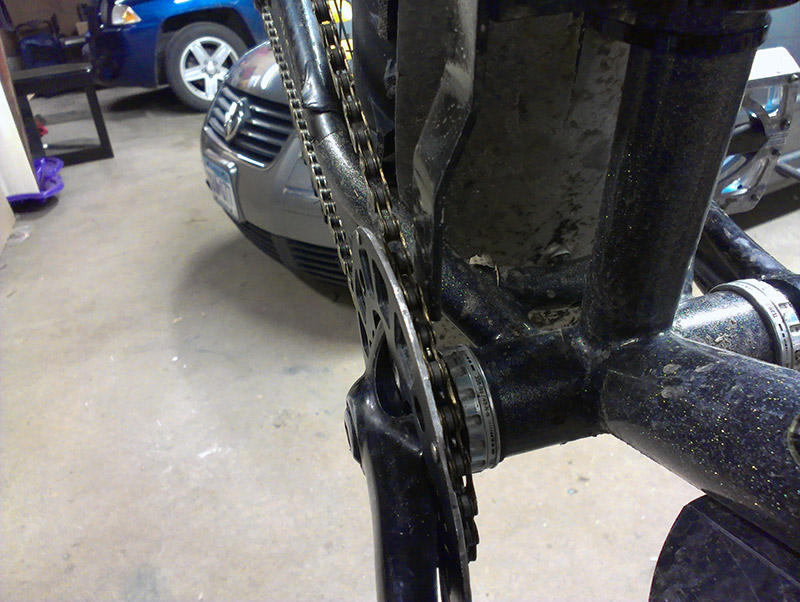
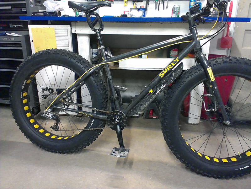
Here is a new flyer design Nicollet Bike Shop out of Mankato MN hired me to create. This is for a first ever lift-assisted fat bike ride and race at Mt. Kato in Mankato. Here is the event page if you are interested in participating. So there are basically zero options for a bash ring if you have a fat bike with a Surly Mr. Whirly Offset Double (MWOD). I decided this winter that I didn't need the big ring of the MWOD 2x crank setup, so I've been running all winter with just the 22t chainring. Works perfect and I don't find myself needing any faster gearing with the soft conditions I ride. If I ever need to get a little more speed, they make a 24t chainring. Well, it looks a little teeny-tiny with just that 22 there. I also wanted a bash just in case and also to keep the chain from wandering off the chainring (not that it has). So I took the 36t big ring I had left over and decided to use this as the ring guard. The Surly MWOD crank set works by bolting the big ring directly to the small ring with spacers, so that is why there are zero options for stock ring guards. I put the 36t chainring in the shop vise and started grinding the teeth off with my rotary tool. That made quick work of the teeth. I tried to round it as much as possible. Once all the teeth were gone I took a file and rounded the sharp edges. Then all I had to do was mount it back where it used to be next to the little ring... and whalla! A Surly bash ring made for a fat bike and a perfect fit! Looks much better.
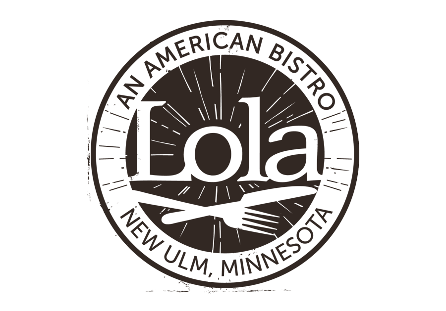
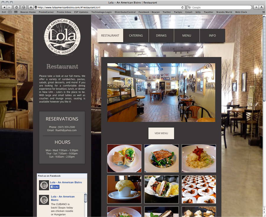
New website and logo design for Lola's in New Ulm.
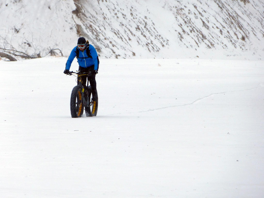
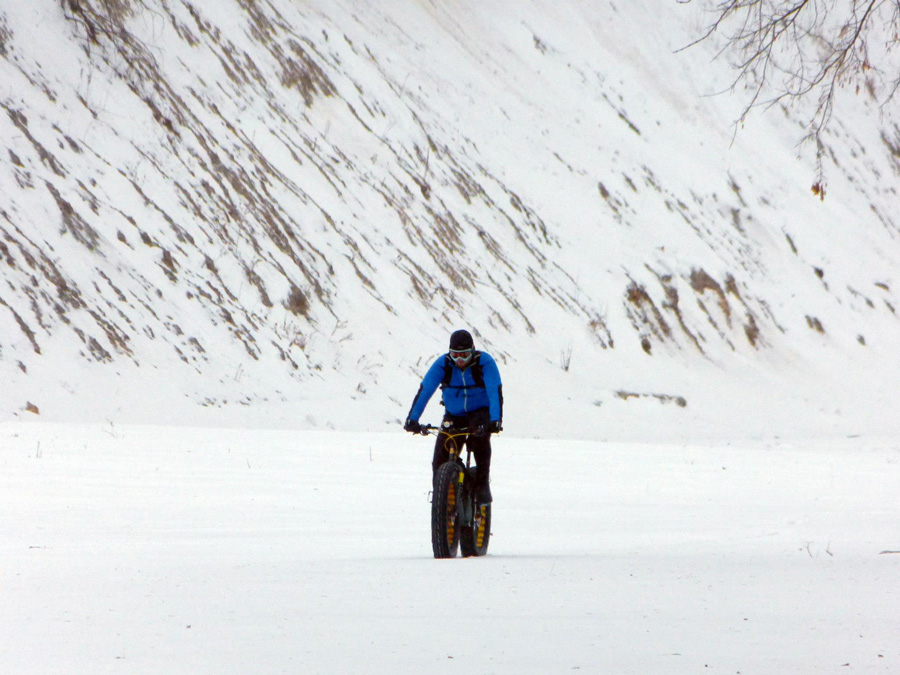
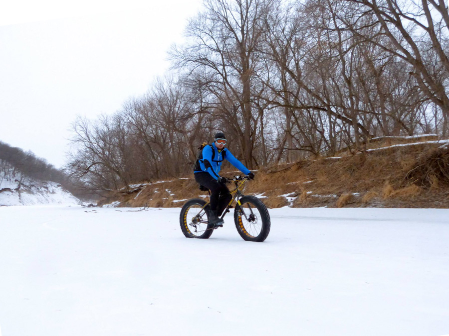
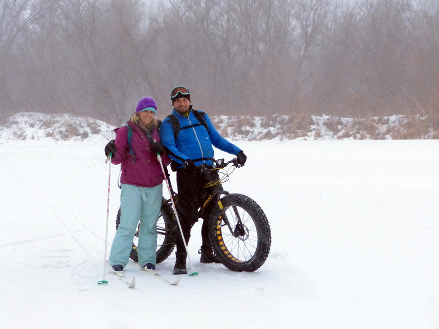
The previous logo was needing to be updated due to a name change. There was also remodeling going on, so it was a good time to do an entire new look overall. The logo has that modern rustic look while keeping it easy to read with modern fonts. There is also a "lino-cut" element to it which gives the entire thing some texture and character. The knife & fork were included to bring something in from the previous logo, but otherwise the look is totally new. The website features 9 pages with restaurant and catering info right up front, a facebook news feed, and listings for their full breakfast, lunch, dinner, coffee, and catering menu. There are image galleries across the site showing interior, exterior, seating, and food photos. I also included a rotating quote/reviews box from satisfied customers at Lola's. The site is also mobile-friendly for on-the-go info for hours, menu, and location. See the logo as well as a website screen shot below. Visit the Lola's website here: www.LolaAmericanBistro.com Well here you go. Check out this compilation of Zeus, our faster than lightning rabbit doing the bunny 500 (running and jumping really, really freaking fast). I thought I'd share some photos once of the winter recreation activity that I love. Fat biking. Especially on frozen snow covered rivers. It also makes for a good area to cross-country ski. My girlfriend likes to ski and with the snow being thick, we can go at about the same pace. So it all works out to be able to do something outside in the winter together.
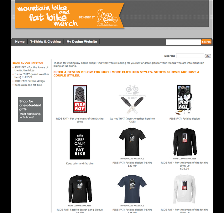
I had to adjust the pressure in the massive 4.8" tires on my Surly Moonlander today to a low low 3 PSI. The snow was tough to stay on top of otherwise. That is all. Here's some pictures. I started a CafePress store now to post some of the designs I have done that relate to mountain biking or fat biking.
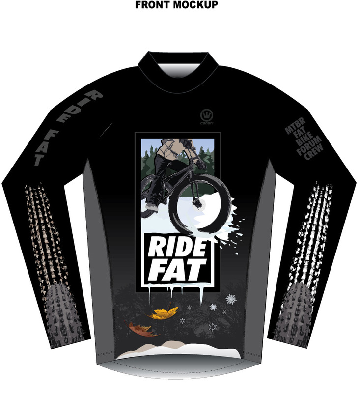
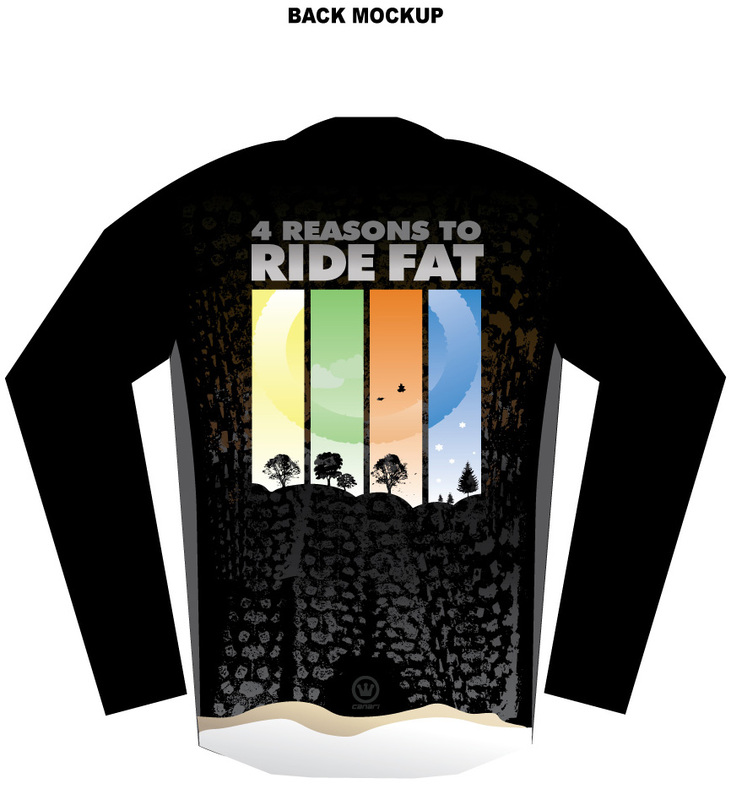
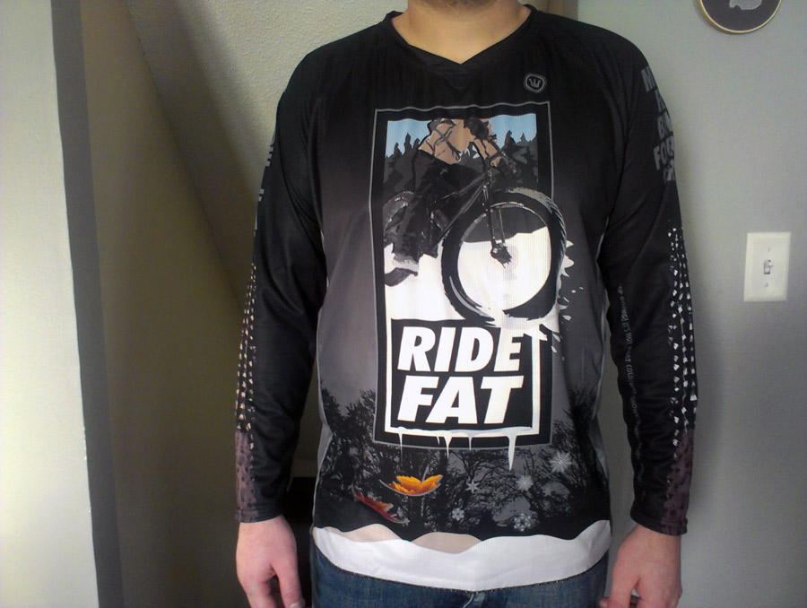
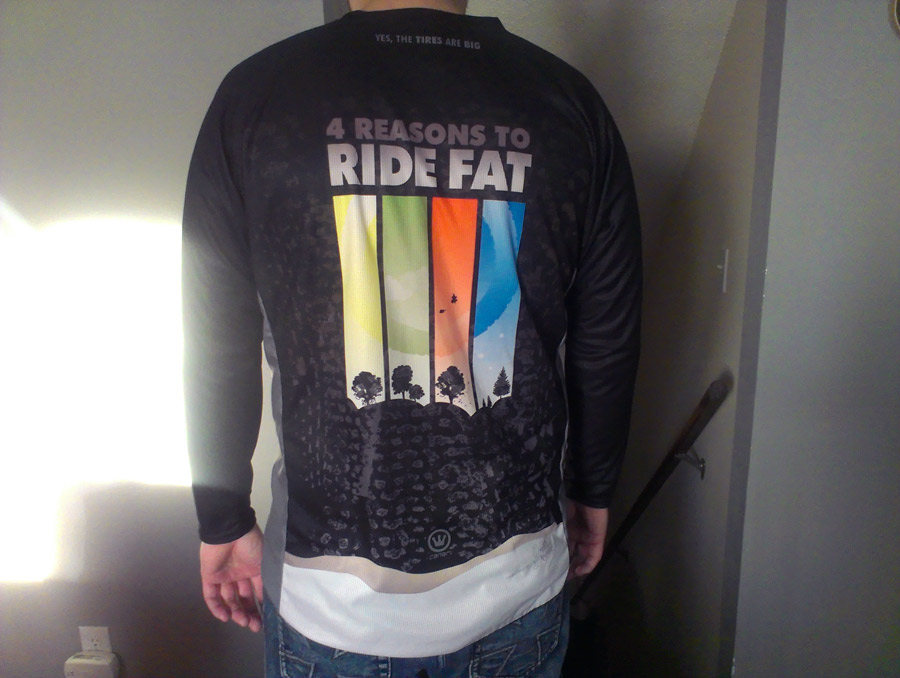
You can click the link below, or the new "Store" tab at the top. Enjoy! www.cafepress.com/mountainbikeandfatbikemerch This is a long sleeve "BMX cut" jersey design for a community mountain bike forum that I frequent. This project started with one guy interested in a jersey that was "fat bike specific" and then we got the ball rolling from there. I took on the design task and he will be handling the ordering for all interested. If you are interested in ordering, more info can be found here. Update!Just got my finished jerseys in the mail... they look great!
They look very well printed and made!!! I usually wear between a Large and an XL T-shirt... the one I am wearing below is a Large and actually fits pretty good. I have long arms and sleeves are about right if not a tad short. I have a 42" chest. I'll probably wear the XL in winter and Large in spring/fall. YOU CAN ORDER THEM HERE WHILE SUPPLIES LAST!  Just polished up this glossy logo with some elbow grease. She had a logo to begin with, which had her name and photography in a script font with a splatter background. She wanted to keep the splatter look, so I stuck with that while also incorporating some cameras with a large one for the focus. I used another script font (which I modified) for the name. Then a more classy sans-serif font for "Photography" as well as making it another color to stand out. Modern and fun - yet serious and professional. :) Visit her facebook page here. |
About this Blog
Just your random run of the mill blog about whatever. Most likely about designs, mountain biking, or rabbits. Archives
June 2016
Categories
All
|



 RSS Feed
